| |
-------- Samplings --------
As we sail from the analog past to the digital future,
here's some of the flotsam and jetsam I espied
in the eternal present.
|
Portrait Mode
Who knows when the first portrait was done? Perhaps a Neanderthal gentleman stood more erect than usual while a fellow tribesman sketched a likeness onto a cave wall with the charred end of a stick. What we do know is that portraiture didn't really kick in as an art genre until the Renaissance, when there suddenly was a need to distinguish among individuals -- this Renaissance man from that Renaissance man. In almost all cases, the individuals being distinguished among were the big shots: the kings, the queens, the titled nobility. For such exotic creatures, portraits were a way of marking their territory -- sending out the message that the sitter, whose haughty gaze could turn a commoner to stone, was the master of all he surveyed.
Of course, the portraitist was also the master of all he surveyed, the sitter a bit of a sitting duck as the artist hunted down the myriad facial and gestural details that would convey, if not a likeness, then at least something that the king might like. Masters in the fine art of flattery, court painters were only as good as their last brushstrokes, and there was always the implicit threat that a smear on the king's image could land one in, say, the Tower of London. It's perhaps ironic, then, that Anthony van Dyck, who did so much to enhance the royal visage of Charles I, managed to hold on to his head, which is more than we can say for Charles I. Visually speaking, van Dyck was the power behind the throne, propping up the very idea of monarchical rule.
Monarchy may have been largely doomed, but portraiture continued to spread its wings. The Industrial Revolution witnessed the emergence of a large, wealthy merchant class eager to mark its arrival via expensive daubs of paint. (John Singer Sargent, who called portraiture a "pimp's profession," would cater to this crowd.) And the science of psychology, which traced its roots back to that Renaissance emphasis on individualism, brought a whole new depth to the art of portraiture. Sittings became epic battles between artist and subject, the former seeking to lay bare the soul of the latter. Or eradicate it altogether. "In Munch and Van Gogh," Robert Hughes wrote about the expressionist approach to limning a likeness, "portraiture resembles a siege laid to the Self by the Other."
Now it was the artist asserting his own individuality -- his eyes as the windows to the soul. By this point, the camera had turned its own all-seeing eye upon the world, and the two art forms -- painting and photography -- have been fighting a Cold War ever since, neither side relinquishing its hold on our attention. For every Richard Avedon or Annie Leibovitz applying a photographic sheen to a celebrity's public image, there's an Andy Warhol slathering the canvas with his fanboy adoration. Warhol's portraits owed a lot to photography, of course -- more specifically, to newspaper and magazine photos, with their inky smudges and off-register coloring. Rolling off the press like grocery supplements, Warhol's portraits were the epitome of art in the age of mechanical reproduction.
And then there's Chuck Close, who's probably done more than any other artist of his generation to extend the reach of portraiture, moving in close (if you'll pardon the expression) to reveal the lunar landscape of a sitter's face, each pore a visual landmark in a roiling sea of craters. Close, too, owes a debt to photography, projecting enlarged photographic images onto canvas, overlaying a grid, and then painting what he sees, one square at a time. Less portraits of people than portraits of photographs of people, Close's paintings explore the so-called uncanny valley, where a face seems so real and yet so unreal that it's off-putting, even disturbing. If Warhol epitomized the age of mechanical reproduction, Close epitomizes the Information Age -- the triumph of raw data.
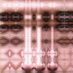
My own venture into portraiture has involved raw data -- the abundance of information that is contained in the average JPEG. For subjects, I chose my friends, who aren't exactly kings and queens but were graciously willing to participate in my little experiment. The sittings were a snap -- literally. I took snapshots of them outside, then uploaded the image files to my iMac and went to work. Photoshop may have a ways to go in simulating a brushstroke, but it's peerless in its ability to copy and paste, slice and splice -- the whole process strangely similar to mitosis and meiosis, the cells replicating and mutating in a rather cancerous fashion. With our remarkable ability to digitally manipulate images, the camera's eye has become the Microsoft Windows to the soul.
Stranded in their own uncanny valleys (the portraits sort of look like them but sort of don't), my friends have been exceptionally good sports. None of them are the selfie type, so having their picture taken at all may feel a little soul depleting. Created in a nanosecond, selfies could be what the art of portraiture has always been leading toward -- the world as one giant photo booth. According to one estimate, 30% of all the images posted by millenials on Facebook, Instagram, and Tumblr are of themselves. A tsunami of narcissism? Not necessarily. Poorly lit and awkwardly composed, selfies are the opposite of glamour shots. Instead, they're closer to a visual diary, a way of saying "I'm here. And now I'm here. And now I'm here. And here. And here. And here."
|
|
Going for the Gold
Color names can be so tricky, but is any color name trickier than "gold"? An art consultant recently commissioned a piece from me, and the color scheme, per his request, was "gold, with deep red and royal blue highlights." There's a lot of room for error in that phrase, but I was especially thrown by the word "gold." It's one of those color names the meaning of which I thought I knew but, upon further reflection, seems rather vague. "A light olive-brown to dark yellow, or a moderate, strong to vivid yellow" is how the American Heritage Dictionary describes the color gold, which is not the same as the metal gold, although the two are clearly related. I'm not sure how a color can be both "moderate" (whatever that means) and "strong" (whatever that means), but we appear to be talking about a medium (whatever THAT means) yellow, with perhaps some green added.
Or are we? The commission, I learned, was for a casino hotel and resort in Macao that isn't afraid to sling a little bling around. (You half-expect the slot machines to spit out doubloons.) That means -- or so I decided -- that the art consultant wasn't talking about a greenish yellow, he was talking about a lustrous yellow, a glowing yellow, a blingy thingy. This being a textile piece, I could have gone with metallic fabrics, but that seemed a little, I don't know, tacky, so I decided to go with a range of yellows -- light to medium-dark -- to generate some luminosity. For that's what distinguishes the color gold from the metal gold: a little bit of shine. Not a lot of shine -- that, as any prospector knows, would be fool's gold. But just enough shine to evoke this most precious metal without attempting to simulate it. If alchemists were unable to turn lead into gold, I wasn't going to have any luck with fabric.
Real-life gold owes its shininess to the 79 electrons that are excitably swirling about its nuclei. (In the periodic table, AU is on the last row that contains stable elements.) Combine that shine with both amazing durability and amazing malleability, and is it any wonder that gold has captured our hearts and fractured our minds for thousands of years? It's also relatively rare, of course. Despite a recent gold rush made possible by new mining techniques, the entire world supply, if stacked up on a tennis court, would rise to a mere 35 feet. No longer tied to U.S. currency, gold continues to be actively traded, as if it had a tangible value beyond the intangible value we more or less arbitrarily assign it. Thus it continues its eternal slumber -- the world's most glittering corpse -- in vaults around the world, no longer actually guaranteeing anything but nevertheless offering reassurance to those who feel queasy about a global financial system made up of 1s and 0s.
Outside a museum, it's hard to find pure gold these days. The gold in most jewelry is an alloy, which reads as anything from a white gold to a yellow gold, depending on what the gold is alloyed with. Inside a museum is a different story. For as far back as anyone can remember, we have been reaching for gold -- pure, unadulterated, 24-karat gold -- to express our artistic ideas and ideals. Hammered in paper-thin sheets, gold leaf is so delicate you have to handle it with tweezers, and its effect -- on, say, a medieval altarpiece or a Byzantine icon -- is other-worldly, an ethereal glow from a higher realm. Gustav Klimt also used gold leaf, of course, literally draping his subjects in their own wealth. But artists don't tend to go with gold leaf anymore -- too expensive, for one thing, but also a little tedious to work with. If you wanted to paint a halo these days, you would probably squeeze some iridescent paint out of a tube.
Before iridescent acrylics, painters who forswore (or couldn't afford) gold leaf had to resort to alchemical magic, surrounding a gold highlight with darker values to create the effect of a metallic sheen. Such tricks are the meat and potatoes of realistic painting, and it's been interesting to watch that witchcraft translate into the digital realm. The color gold, you might be interested to know, has finally been nailed to the wall. Its RGB values are 255, 215, 0. Its CMYK values are 0.00, 0.16, 1.00 and 0.00. And its hexadecimal code is ffd700. Thus has a particular shade of yellow come to represent all our thoughts and feelings associated with the word "gold" -- at least on the Web. Early on in the Internet era, there were only so many colors to go around -- 256, to be exact -- and someone (I'm not sure who) decided that this very particular one was gold. Midas himself would have envied such power.
Today, there is still a list of so-called Web-safe colors, which are standardized across all the major browsers, and "gold" is on that list. But computers are now capable of mixing millions of hues -- more than the human eye can discern. And it starts to seem rather arbitrary, if not downright goofy, that only one of them is called gold. Computers have had an utterly profound effect on our sense of color, simplifying it and complicating it at the same time. The simplifications I'm rather used to, having grown up with Crayolas, which also extract from the vastness of the color spectrum a tidy set of hues. (Crayola's gold looks like putty to me.) As for the complications, you could spend your whole life trying to sort those out and never really get anywhere. Even my little attempt to understand the color gold has ended where so many quests for gold end -- with the prospector both scratching his head and itching to dig deeper.
|
|
Random Thoughts
I recently won a game of Monopoly, crushing my opponents with a combination of business savvy, heartlessness and, of course, luck. That one of my opponents was a seven-year-old child does not diminish my achievement. He came in third and owned both Boardwalk and Park Place, an often unbeatable pairing. Also, he'd won the previous game with his own combination of business savvy, heartlessness and, of course, luck. Unfortunately for him, his business savvy consists of being willing to do whatever it takes to get his hands on Boardwalk and Park Place, which I gladly traded him for Ventnor Avenue, thereby completing my own rather upscale monopoly. Then, I patiently waited for everyone to land on one of my three properties instead of one of his two. It didn't take long, although there were a couple of touch-and-go moments when it looked like my evil plan might blow up in my face.
In each of those moments, I got a "lucky" roll of the dice, barely skirting a visit to the hotel-studded neighborhood of Oriental, Vermont and Connecticut avenues. And I started to wonder (heartlessness aside) how much of my success was due to business savvy and how much was due to luck. Like life itself, Monopoly rewards those with intelligence, determination and a hot hand. Also like life itself, it doesn't break down your score -- 32% intelligence, 28% determination, 40% hot hand. It simply allows you to win or forces you to lose, then leaves it up to you whether to draw the conclusion that Donald Trump has finally met his match. Trump, of course, has had his share of financial woes over the years, casting a shadow over his much-vaunted (mostly by himself) business savvy. But there's no denying Trump's determination. Like a bad penny, the guy just keeps turning up.
There's also no denying Trump's lucky streak, which began with his winning the lottery -- specifically, the genetic lottery. Put another way, Trump chose his parents well. His father, Fred Trump, was already a successful Manhattan real estate developer when The Donald was still reading Horatio Alger stories. The son of a truck driver, I don't begrudge Trump his limousine rides to the Wharton School, but just once I'd like to hear him say that he, too, has spent some time with Lady Luck -- that it was her, for example, who convinced him his gravity-defying hairdo would enhance rather than dispel his mystique. (What were the odds?) I've always been fascinated by the concept of luck without feeling like I've gotten more (or less) than my fair share of it. If I'd had more luck, I might have dismissed it, as Trump has done. If I'd had less, I might have leaned on it, like a crutch. Instead, I'm always mulling it over, like the enigma it truly is.
What I like about the concept of luck is that it acknowledges how little we know about what's going on around us. If the roulette ball lands on our chosen number three times in a row, we say we've been (extraordinarily) lucky because the alternative is to invoke the supernatural -- God, karma, the Force. And many of us would rather believe in chance than in magic. Like luck, chance is an elusive concept. It basically means, though, that something could happen for no discernible reason. For example, I could get hit by a bus tomorrow -- but wait a minute, that wouldn't be for no discernible reason. I would have to be walking outside, and the bus driver would have to be distracted at exactly the right/wrong moment. What interests me about chance, as we learn more and more about the world around us, is that, outside of game situations, it no longer seems to play a very major role in our lives. There's always some kind of explanation -- more of them every day, in fact.
It's always nice to be reminded that we live in a random universe, so I really do hope to get around to studying quantum mechanics someday. In the meantime, randomness seems to be on the run -- in my life, anyway. Consider random numbers, which I used to collect as a child, like seashells. There used to be pretty straightforward ways to generate random numbers. For example, I used to have a bingo cage, and I would spend hours faithfully recording each draw in a spiral notebook, then pore over the list for patterns. Today, most random numbers are generated by computers, if only because the computers themselves need extremely long lists of random numbers to perform some of their duties. (On the simple end of things, consider the iPod's shuffling feature; on the complex end, there's cryptography.) They do it using algorithms, which are sets of mathematical manipulations applied to "seed" numbers. And I know what you're thinking: How can a mathematical equation generate a random number?
The answer is that it can't. Computerized generators result in what are known as pseudo-random numbers -- random enough for practical purposes, depending on what those practical purposes are. In other words, the pseudo-random numbers have to pass a test -- a series of tests, actually, performed by mathematicians and statisticians. If the tests don't uncover any list-deriving patterns, the pseudo-random numbers are good to go. But here's where things get kind of tricky, for even random numbers will at least appear to fall into patterns, and with surprising regularity. In fact, if a list of pseudo-random numbers reveals absolutely no patterning, the mathematicians and statisticians start to get a little suspicious. So, there's always this balancing act between randomness and pseudo-randomness, pseudo-randomness and pattern, pattern and meaningful pattern. The fact is, we can never be completely sure that a list of numbers is truly random.
But we can act as if we do -- take it on faith, so to speak. Which is what we're increasingly doing in realms that used to rely on unadulterated chance. Most government-run lotteries now use computational rather than mechanical random-number generators -- that is, pseudo-random numbers rather than random numbers. And the gaming industry, like the music industry before it, is slowly succumbing to digitalization. Many a one-armed bandit, for example, still has the arm, but it's vestigial, a mechanical appendix; a microchip is calling the shots. Admittedly, the odds have always been against us when we headed to Las Vegas, but at least we knew we were drawing on life's great unknowability -- everything that falls outside Isaac Newton's clockwork universe, with its natural laws and reasonable explanations. How ironic that, at a time when physics has embraced life's utter chaos, Lady Luck has cleaned up her act.
For those seeking random numbers, there are ways of tapping into life's utter chaos, but they tend to be more complex, more time-consuming, more expensive. Physical (as opposed to computational) random-number generators rely on real-life phenomena the unpredictability of which can be traced to the laws of quantum mechanics, which describe the behavior of atoms, electrons and nuclei. I'm referring to things like radioactive decay, thermal noise, clock drift, etc. And what's interesting is that, even here, certain adjustments have to be made; various asymmetries and systematic biases have to be accounted for. It seems that, no matter where we look, little puddles of order start to encroach on the pure randomness we seek. Many consider that a good thing, of course. The mathematician Robert Coveyou, for a 1970 article he published in the scholarly journal "Studies in Applied Mathematics," came up with this title: "The Generation of Random Numbers Is Too Important to be Left to Chance."
That's a lovely paradox, recognizing as it does our constant need to keep chaos at bay. For whatever reason, we abhor chaos, crave order. Or, as Ivars Peterson puts it in his book The Jungles of Randommess: A Mathematical Safari, "Humans are model builders....We are programmed to search for patterns and to invent explanations, and we find it difficult to imagine that patterns emerge from randomness." Personally, I don't find it that difficult to imagine. In fact, I rather like the idea that there are infinitely vast pools of chaos out there for us to draw upon. Yes, there's the possibility that true randomness doesn't really exist, that what appears to be truly random is simply waiting for our supercomputers to scour for patterns and explanations. Albert Einstein, when confronted with the physics of quantums, famously said, "I am convinced that God does not play dice." But despite our efforts to tame chance, to win the Monopoly game of life, it's beginning to look like God plays dice after all. Or, as some people believe, maybe the dice are playing Him.
|
|
On the Dot
"You gotta get a gimmick," the trumpet-playing stripper sings in Gypsy, and whatever you might think about Roy Lichtenstein, he certainly had a gimmick. A charter member of the Pop Art movement, which swept across the country like a Mad Men ad campaign, Lichtenstein had one really big idea and a career's worth of smaller ones. The really big idea was that all images, from Rembrandt on down, are constructs, fabrications, glorified works of fiction. (If this were the 1980s and I was up for tenure, I'd add the word "signs.") And the career's worth of smaller ideas were the various realms where Lichtenstein chose to expose the mannerisms that images fall prey to over time. Early on, he hoisted the Abstract Expressionists on their own petards, reproducing their heroically overwrought brushstrokes in a cool, flat comic-book style. The wit was so dry it was like being asked to lunch by Hannibal Lechter.
Technique-wise, Lichtenstein's gimmick was the benday dot, which he sprinkled onto his canvasses like dandruff. Named for Benjamin Day, a 19th-century illustrator and printer who wanted to add a little more depth and a lot more color, benday dots are what you used to see when you held a magnifying glass over a comic-book rendering of, say, Superman's cape -- a vast field of tiny circles arranged in neat little rows, the overall color determined by the dots' hue and density. (A little less density and Superman's red cape turns pink.) It was a nice parlor trick, the dots blending into areas of solid color when the eye was kept at a suitable distance. And it allowed printers to mechanically reproduce images that, although they didn't seem drawn by hand or stroked by brush, nevertheless brought a flash of artiness to the low-quality newsprint paper they were printed on.
It was that low-quality newsprint paper that Lichtenstein wanted to evoke, stocking his canvasses with the signs (sorry, I couldn't help myself) of cheap commercial illustration -- all the visual tropes of product packaging, newspaper ads, etc. He wasn't a fan of the funnies, but he knew that there were millions of them out there, and it must have fascinated him that they were so willing to accept the medium's flat areas of color, its coloring-book outlines, its often cheesy content. His early comic-book paintings don't do much more than reproduce, at mock-heroic scale, individual panels from actual comic books, complete with word balloons. There was, of course, the usual reaction on the part of the art establishment: "What are these things doing in a respectable gallery?" But the paintings held up, arching an eyebrow at both sides of the art/commerce divide. Tongue firmly in cheek, they had that indescribable quality called "pop."
In his seminal 1936 essay "The Work of Art in the Age of Mechanical Reproduction," German cultural critic Walter Benjamin argued that, surrounded by copies of things, we no longer have the same relationship with the originals. Art has lost its aura -- its air of authenticity. More precisely, we've lost art's aura, buried it under a mountain of JPEGs. And what are artists supposed to do under such circumstances? Benjamin didn't say, but had he lived long enough, I like to think he would have felt a kinship (despite his Marxist beliefs) with the Pop artists, who, rather than mourn the death of art, decided to dance on its grave. They weren't alienated by Main Street U.S.A., in all its ticky-tacky splendor, they were amused, excited, turned on. The American Century may not have been the Italian Renaissance or the Dutch Golden Age, but it was the period they were born in, and it was up to them to paint it.
Literally and metaphorically, Lichtenstein painted it through a scrim, using the benday dot technique to put some distance between his subjects and himself. He could have put even more distance between his subjects and himself if he'd pinned an actual comic-book panel on a gallery wall, declaring it art the same way that Marcel Duchamp had declared a bottle rack, a snow shovel, and a porcelain urinal art -- by placing them in an art-world context. But Lichtenstein was first and foremost a painter, despite his urge to leave behind no trace of painterliness. He created his own stencils for applying the dots, which varied in their machine-like precision over the years. And if you look at his actual canvasses up close, you see that they're clearly paintings. He wasn't making mechanical reproductions, he was making art about mechanical reproductions -- art about art that, one way or another, had fallen into a groove, if not a rut.
Compare that to Georges Seurat, who also used dots of color in his paintings but who was utterly sincere in his desire to create a new kind of luminosity. Lichtenstein, in contrast, was an ironist -- art's Cheshire Cat, here one minute, gone the next, leaving behind nothing but a grin. Some art lovers felt that the joke eventually wore off, got a little tiresome -- that by covering everything with dots, Lichtenstein had painted himself into a corner. But I've always liked where he placed his work -- on the border line between art and non-art, serious and playful, magic and con game. And I've always been drawn to benday dots, which are both mesmerizing and banal. At a small enough scale, they literally fool the eye -- trompe l'oeil. At a large enough scale, they get caught in the act -- a con job. But at just the right scale, where Lichtenstein often put them, they get caught in the act while fooling the eye. I find that irresistible.
|
|
Isn't It Romantic
I was at the Chicago Art Institute a couple of years ago, aimlessly wandering among the galleries, when I suddenly found myself, all alone, in front of Grant Wood's American Gothic. What was going on here? Where were my fellow art-lovers? Why wasn't I having to crane my neck to catch a glimpse of those starched-white Iowa farmers through a phalanx of iPhones? Like an art thief, I took advantage of my unexpected access, moving in so close I could practically smell the manure wafting into the picture plane from a nearby pasture. American Gothic isn't exactly my favorite painting, but it's certainly had a long, rich history as a cultural touchstone -- an image reproduced so many times, in so many ways, that we tend to forget there was once an artist sitting or standing in his studio, applying daubs of paint. Here were those daubs.
It should have been a religious experience, or at least an aesthetic one -- all but rubbing my nose against a visual icon. We are surrounded by screen images these days -- TV, movie, computer, phone, wristwatch -- but we don't get many opportunities to see, up close, the original deposits from which the world's image bank is drawn. To view the Mona Lisa, for example, you have to join thousands of other paparazzi for your 15 seconds of reflected fame. That day in Chicago, though, it was just me, alone with a legend, and I tried to make the most of it, as one would do if one found oneself, say, alone in an elevator with Julia Roberts. But after admiring Wood's paint-handling skill, I must confess, I felt stymied. Instead of a religious relic suffused with the Holy Spirit, American Gothic was transubstantiating in reverse -- back into a beaverboard panel covered with clumps of pigment suspended in oil.
Art has always partaken of the spiritual and the material, the sacred and the profane, the sublime and the ridiculous. But over the last 50 to 100 years, the balance seems to have shifted from the former to the latter. Gone are the days when art objects routinely carried a talismanic power -- tools with which to invoke the spirit world. Gone, too, are the days when God routinely made art in His own image -- all those adorations of the Magi and ascensions of Jesus, the annunciations and pietas. Gone, even, are the days of the Romantic sublime, when all that religious fervor was transposed to the natural world. Painters like Caspar David Friedrich and Frederich Church could find God in a single blade of grass, even though the paintings themselves, IMAX screens before their time, were vast panoramas meant to fill the viewer with awe at nature's sheer magnitude, its divine splendor.
When photography stole painting's thunder, faithfully recording the many wonders of the world, artists had to look elsewhere for a higher calling. Some found it within their own roiling psyches, which they transferred to the canvas via lashing, slashing brushstrokes. Others delved even farther inward -- into the roiling psyche of the collective unconscious, the 20th century's heart of darkness. We tend to forget this today, but Mark Rothko, for example, was a cosmic warrior locked in battle with eternity. His paintings of glowing rectangles, which look so nice on a set of notecards someone bought me, are supposed to help us transcend the here and now, put us in touch with the sheer hell of being alive after God (followed by Elvis) has left the building. "Yahweh's official stenographer," Robert Hughes once called Rothko, picking up on the painter's Old Testament fury, his tragic lamentations for our lost faith.
Today, when I see a Rothko in a museum, I'm not exactly filled with pity and terror. Instead, I feel calm, contemplative, slightly suspended in air. Rothko's rectangles have a way of floating -- one inside the other, then the other inside of it -- and this can leave you feeling like a helium-filled balloon. A brushstroked metaphor for modernist doubt? Perhaps not, but it isn't just art-for-art's-sake either. Like most great works of art, Rothko's paintings jigger with your brain, leave you in an altered state, and that seems like more than enough to ask of a painting. But Rothko himself asked much more, and he would surely commit suicide all over again if he knew how cozy a niche we've found for him in the history of art. He's the last serious artist in an age that no longer takes seriousness seriously -- a true believer, even if what he believed in was the difficulty of believing in anything. What he believed in, of course, was art.
And the sublime? Has that been rendered ridiculous? Or was it always ridiculous? Peter Schjeldahl, now the art critic for The New Yorker, once referred to the sublime as "a hopelessly jumbled philosophical notion that has had more than two centuries to start meaning something cogent and hasn't succeeded yet." I like the leeway that Schjeldahl's insight leaves for those of us who can't quite believe in the sublime but can't quite let it go either. Using Adobe Illustrator, I've been creating vector-based images that consist of thousands of pixel-like squares, each square assigned a color, the colors arranged into gradations that float pass one another, subtly changing as the eye moves through the composition, looking for a resting point. When it comes to art, I'm not always my biggest fan, but I do find these images rather mesmerizing. At once placid and abuzz, they put me in a trance state.
Or are they putting me to sleep? Because there's also something rather stultifying about these images. They're blandly beautiful, like an international spokesmodel. To create the color gradations, I took the RGB values of the two outer colors and divided up the numerical values in between. There was no spontaneity, no gesture, no handling of any kind. There was just me and my calculator app. Digital art has an aura of perfection; everything down to a single point of light can be specified. But as we all know, perfection is off-putting, even a little creepy. When I stare at these images, my mind starts to go blank, slide down a void. I sometimes think of them as delvings into the computer's own roiling psyche -- the kind of images that must float through its brain in sleep mode. But are these dreams or nightmares? Isn't there something rather terrifying about such a vast panorama of sheer perfection?
"When you gaze long into an abyss," Friedrich Nietzshe famously wrote at the height of the Romantic era, "the abyss will gaze back into you."
|
|
Bugaboo
I figured it must be a bug. A newbie, I'd been finding my way around Adobe Illustrator -- well, "finding" may be overstating the case. Like the young Helen Keller, I was mostly bumping into things and screaming at whoever had created such a dark, impenetrable cosmos. Having now tried them all -- how-to books, online tutorials, person-to-person tutorials (at $50/hour) -- I'm here to tell you that there's no good way to learn how to use this vector-based image-processing application. Instead, you have to just keep hurling yourself at it, bashing your head against the wall until your brain, sufficiently numb, can no longer put up an adequate defense. Then and only then does the software seep into your neural network, allow you to, for example, create a shape with a stroke and a fill.
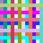
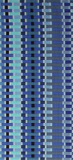
Which I've now done 9216 times in a work I'm calling Sun Microsystems, after the computer company that was riding high in the sky during the tech boom of the late-1990s. Laid out in a 96 x 96 grid, this pixellated landscape consists of a series of diagonal lines running from the top-left to the bottom-right, each line consisting of a series of quarter-inch squares, all of which have the same CMYK values. Normally, those would be pretty easy to assign: You would simply select each square along a diagonal while holding down the Shift key, thereby selecting all of them at the same time, then globally enter your values. But I'd committed a rookie's error: Rather than starting from scratch, with a blank grid, I was reassigning values to a rough sketch I'd done of Sun Microsystems, in which I'd used 8 x 8 blocks of alternating (but very similar) colors.
I was hardly the first artist to paint over an already painted canvas, but it made a lot less sense in my case, given that there's no shortage of "canvas" around here. (Select File, select New.) And if I'd known more about how Illustrator works, I would have realized that I was making things more difficult for myself. Instead, I assumed I was dealing with a bug. (First, blame the software.) And here's how the bug manifested itself: When I would select the first square on my way up a diagonal, the Color Panel would assume the CMYK values I'd assigned to that square during the rough-sketch stage, and it would hold on to those values as long as I selected another square that I'd assigned those same values to. But, remember, I'd assigned values in 8 x 8 blocks, so the Color Panel would hold on to those values for, at most, seven squares.
Then it would crash.
Well, not crash, exactly, but it did render me incapable of selecting all the squares in a diagonal (as many as 96 at a time) and globally assigning their CMYK values. Instead, I had to assign the (same) values one square at a time -- a veritable Mt. Everest of tedium. It's funny how the mind works, though. I didn't figure out the underlying 8 x 8 problem until I'd gone through a long, largely unconscious debugging process. At first, it seemed totally random. I'd be going along and "Boom!" Then, I started to sense a pattern: I would crash more often in some rows than in others, and sometimes I wouldn't crash at all. Then, I noticed that some rows were six squares of no-crash followed by two squares of crash. Then, I noticed that a six-two row was followed by a five-three row followed by a four-four row. Then -- Eureka! -- I remembered that I'd sketched things out in 8 x 8 blocks.
Okay, nobody's going to be hiring me as a software tester anytime soon, but there was an undeniable pleasure in solving the riddle, restoring order to seeming chaos. Bugs have been bedeviling programmers since at least 1947, when Grace Hopper, who developed the first compiler for a computer programming language, attributed an error in Harvard's Mark II computer to a moth she'd found trapped in one of the relays -- so the story goes, anyway. Regardless of who actually found it, someone (not Hopper) was cheeky enough to tape the moth to the daily logbook and, just beneath it, scribble the words "First actual case of bug being found." Personally, I would have gone with "First case of actual bug being found," which might have prevented some of the subsequent confusion over whether this was the first computer bug or not. (It wasn't.)
Nevertheless, the logbook has assumed its hallowed place in the annals of time, currently residing in the Smithsonian's National Museum of American History, which has uploaded an image of the relevant logbook page on its website. By zooming in, you can verify that it is truly a moth, if not (upon further zooming) the creature from the Alien movies. Bugs are undeniably a pestilence upon the computer landscape. (Programmers often spend more time debugging code than they spent writing it.) And sometimes they swell to monstrous proportions -- in the public's imagination, anyway. Y2K threatened to put a severe damper in everyone's end-of-millenium plans, the entire planet about to succumb to the Blue Screen of Death. Instead, we all woke up the next morning, slightly hungover, and logged on to AOL.
Sometimes, of course, bugs are insidiously small -- so minor as to go unnoticed, perhaps forever. But sometimes they're so elusive they turn lethal. In Ellen Ullman's brilliant The Bug: A Novel, a computer programmer is bitten by a bug that sends him into a fever dream of guilt and recrimination, fear and loathing. Buried in his work at Telligentsia, a software development company, Ethan Levin only comes up for air when it's time to insult a colleague or say the wrong thing to his live-in girlfriend. But what should have been a tiny bug in the user interface he's designing has been metamorphosing, Kafka-like, into the Grim Reaper. For some reason, no one's able to capture an image of the bug in the core file. Instead, it waits, silently, for the next venture-capitalist demo, then strikes, freezing the program in its tracks. Ethan's fellow employees refer to it as "The Jester."
An English major turned software engineer, Ullman captures both the horror and the banality of computers, the way all those ones and zeroes can drive a person mad, so mercilessly do they follow the logic they've been assigned. Ullman also captures the mystery that lies at the heart of computers; or it is a mystery we're projecting onto them? Like any horror-story monster, "The Jester" takes on a life of its own, mocking its creators for neglecting to see the errors of their ways. In a similar fashion, my little bug (if it even is a bug) almost seemed to be speaking to me, taking me by the hand and showing me how to work around it. Artists become intimately familiar with their tools over time. (Rembrandt knew just how to load up his brushstroke to get the effect he wanted.) As for me, I figure I'll have achieved complete mastery of Adobe Illustrator in -- oh, I don't know -- 9216 years or so.
|
|
Tile, Toil and Television
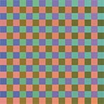
Recently, I've been dipping a toe into the rarefied realm of digital art while the other foot remains firmly planted in the art and craft of quilting. The biggest difference I've noticed so far is that it doesn't take me 100 hours to execute any ol' idea that happens to float through my head. Another big difference is that I'm now working with pure color -- beams of light that don't appear to be reflecting off of anything. Digital art has a long ways to go before it receives the respect that painting (though on the decline) still receives, but on this ontological level -- the materials out of which art is made -- it may have an advantage. Pigments, when arranged in the right way, create the illusion of light. Photons, no matter how you arrange them, light up like Christmas trees.
With that one foot still firmly planted in quilting, I've been setting up grids -- my old familiar squares and rectangles. And I've been struck by how old-fashioned this newfangled medium can be made to seem. I just finished a piece called Background Checks, which consists of 2304 squares laid out in a checkerboard. Because I wanted certain groups of squares to fade from one color to another, I had to systematically enter the CYMK values for each of those 2304 squares. Yes, it was tedious, though considerably less than 100 hours of tedium. And, I must confess, there was a certain God-like pleasure every time I pressed the "Let There Be Light" button. What this boringly methodical process most reminded me of, though, was laying tile -- one tessera after another, each ready to play its humble role in God's (i.e., my) divine plan.
The ancient art of mosaic spread through the world like a meme, captivating the Greeks, the Romans, the Byzantines, Christians, Muslims -- anybody with a blank wall or floor upon which the artistic impulse could be inlaid. Pedestrian materials were often used: glass, stones, shells. But the effect was anything other than pedestrian, a kind of primitive magic occurring as the individual tiles fused in the mind, forming richly decorative patterns or surprisingly life-like portraits of god, man and beast. A media theorist like Marshall McLuhan might recognize these ancient mosaics as an early forerunner of television -- pixellated images avant la lettre. For what is television but a series of mosaics brought to jittery life by repetition and variation?
In the same way that television replaced radio without actually replacing it, frescoes dealt mosaics a blow they're still recovering from. It seems that daubing paint on a wall was a hell of a lot less labor-intensive that laying tile. It was also a hell of a lot more fun, the mixing and blending of pigments providing their own kind of primitive magic, the analog kind. Today, mosaics seem less art than craft -- much more likely to appear on a bathroom wall than a living-room wall. A pattern nut, I have tilework on my bathroom floor, on the floor of my front foyer, and as a sink backsplash in my kitchen. And on my living-room wall, behind the piano, in a position of prominence? There, I have a triptych of watercolors by a friend. It would never have occurred to me to slap some tile on there instead.
It might have occurred to me to hang one of Chuck Close's mosaic-like portraits, however, if I were fortunate enough to own one. For decades now, Close has been slowly, methodically turning out head shots of his friends, each one an amalgamation of small, often square units that Close meticulously paints, working off a blown-up photograph over which a grid has been laid -- paint-by-numbers taken to the nth degree. Reaching as high as nine feet, these paintings present a strange blend of intimacy and detachment. They seem to capture every freckle, every wrinkle, every nose hair while letting the sitter's soul slip away. Over time, they've become less photorealistic, the individual units deliquescing into pools of pigment. And the sitters have subsequently developed a leprous sheen -- portraiture in the Age of Too Much Information.
In that McLuhanesque way, mosaics keep reappearing while disappearing. The vogue for photomosaics -- those large photographs that consist of numerous smaller photographs, the smaller photographs often related to the large ones in some kitschy way -- still hasn't completely run its course. And digital artists literally have mosaics at their fingertips. (In Photoshop, select Filter, select Pixelate, select Mosaic, et voila, vous etes une artiste.) Where I was surprised to see mosaics make yet another comeback, however, was in the recent release of Windows 8, Microsoft's forward-looking (yet strangely backward-looking) operating system for tablet computers and other touchscreen devices. Eschewing menus, Microsoft has gone with a grid of plain-colored tiles for its Windows 8 user interface, the tiles always ready to be rearranged to reflect the user's workflow or whims.
There was resistance at first, users dragging their feet before beginning their climbs up a somewhat steep learning curve. But things seem to have settled down now, and there may be an audience for the simple shapes, plain colors, no-design design that Microsoft has created. I spend most of my time in the Apple ecosystem, with its wood-grained bookshelves, its highlights and shadows, its user-friendly icons. Skeuomorphia -- making a design element look like something from the real world -- has run rampant on the Web, thanks in part to Steve Jobs. But something deep inside me longs for a simpler time when you would lay one tile next to another, then another, then another, each tile a unit of pure color, each color effecting the other colors around it, the whole greater than the sum of its parts, but the parts right there where you can see them.
|
|
Pixelated
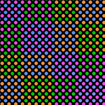
I just bought a new computer monitor -- a 23-inch Dell that bills itself as "Ultra-Thin." One can never be too rich or too thin, as the memorably rich/thin Duchess of Windsor once said, and in addition to largely confining itself to two dimensions, my Dell S2330MX is capable of spitting out 16.7 million richly vibrant colors, with a "FullHD" resolution of 1920 x 1080 at 60 Hz. We're talking pixels, of course -- 1920 rows of them, each containing 1080 pixels, for a grand total of 2,073,600 little dots of color. Actually, it's 6,220,800 little dots of color, because pixels, like atoms, can be further divided -- in their case, into subpixels, which are the true building blocks of digital imagery. And pixels aren't really little dots of color, truth be told. They're staggered squares or staggered rectangles of color, sometimes even staggered triangles.
Ever since I first learned about them, I've been fascinated by pixels -- this sense that if you keep zooming in on the screens we now spend so much of our lives immersed in, you'll arrive at the basic unit -- the cell, the atom, the quark, shimmering like a distant star (or maybe just a lightning bug) in the night sky. Even the name -- "pixel," from "picture element" -- suggests getting to the bottom of something, boiling it down to the essential, the irreducible, the elemental. Philosophers and scientists have been doing that to physical reality at least since Leucippus and Democritus, but lately their quest has started to leave the rest of us behind -- too much math, for one thing, which means we have to take a lot of quantum mechanics on faith. To actually see a quark, for instance, you'll need to get ahold of a particle accelerator.
Because they consist of discrete units that, reduced sufficiently in size, fool us into thinking we're seeing something smooth and continuous, digital images are considered rather cheap, even gauche -- a trompe l'oeil parlor trick. And art techniques based on the same principle -- mosaic, cross-stitch, patchwork -- tend to get relegated to the craft ghetto. But I've always thought there was something magical about the way a few thousand points of light can be arranged into a reasonable facsimile of, say, a Rembrandt painting -- the same sort of magic that occurs with a series of carefully chosen brushstrokes. From a vast field of red, blue, and green subpixels emerges, on my shiny new screen, a self-portrait of Rembrandt himself -- widowed and bankrupt, weary yet defiant, his heroically pitiful gaze reaching across three and a half centuries.
The closest that pixels have gotten to high-art cachet was when Georges Seurat used them to construct strangely quiescent scenes of French life in the 1880s. Seurat didn't call them pixels, of course, but his daubs of paint, each its very own color, anticipated the technological developments that would lead straight to this computer monitor sitting on my desk. Pointillism was something of a scientific breakthrough, based as it was on the color theories of Michel Eugene Chevreul and others. And one might have expected a more dynamic effect -- the painterly equivalent of Brownian motion, say -- from a technique that involved elementary particles of color buzzing around one another, like electrons. Paradoxically, Seurat's paintings seem just the opposite -- brief moments frozen in time, for all time.
What gives them their poignance are the particular moments Seurat chose to freeze -- most famously, A Sunday Afternoon on the Island of La Grand Jatte. Risking the label "Sunday painter," Seurat threw himself into this depiction of the French bourgeoisie at play, endowing their middle-class frolics with the formal dignity of Egyptian hieroglyphs. And although there's a stiltedness to the painting, everything arranged just so, there's also a jitteriness that seems to herald what will eventually be called the "Age of Anxiety." "Seurat had grasped that there is something atomized, divided, and analytical about modernist awareness," Robert Hughes wrote in Shock of the New, his history of modern art from the Impressionists onward. Analytical by temperament, Seurat couldn't help but look at the world around him through a microscope.
By splitting the atom of color, Seurat hoped to achieve a kind of luminosity that artists before him had only dreamed about, but it didn't exactly work out that way. There's a bleached quality to his paintings, as if they've been left out in the sun too long. And I'm not basing that opinion on reproductions in books and on computer screens. It is strange, though, to look at his paintings on my new Dell S2330MX -- his little daubs of paint turned into little dots of color that aren't really dots. I imagine Seurat would have loved the backlit images that our computer monitors send our way, although he might have balked at being limited to only 16.7 million pixel combinations. He devoted his life to what he considered color's infinite possibilities and would have been disappointed to learn that only about 10 million hues are discernible to the human eye.
|
|
Hip to Be Square
"I think a person could spend his whole life just sewing squares together," my friend Sally, who's a quilter, once said to me. "I'm counting on it," I told her, and 12 years later I'm still sewing squares and rectangles together, only occasionally venturing into the murky realm of the triangle. Most quilters come fully loaded with skill sets that have been honed in dozens, if not hundreds, of classes, workshops and retreats. I've never taken a class or a workshop, never gone on a retreat. But I like to think that's not the only reason I'm still sewing squares together after all these years. A bit of a square myself, I love its regularity, its uniformity, its predictability, its willingness to bore us to death while offering us a vision of perfection.
Plato, too, must have loved the square -- an ideal form if there ever was one, beckoning us to a world beyond mere appearances, the realm of pure thought. On a more practical level, squares have always struck me as the building blocks of civilization. They don't occur in nature -- not with crisp 90-degree angles, anyway. And they almost demand to be stacked, turned into modules -- the whole built environment as an elaborate Rubik's Cube. "The grid represents the human quest to impose order on a chaotic world," Michael Auping writes in a catalog essay to an exhibition called Abstraction Geometry Painting, where he nails the pivotal role that the square has played in the history of modern art.
In 1915, Kasimir Malevich painted a black square on a white background and forever changed what we mean by the word "art." Like other early abstractionists, Malevich was drawn to the square's (and the circle's) purity, the idea that mathematics, if considered in the proper frame of mind, could lead one to a transcendental state. Malevich's paintings, though much more worked over than they appear in reproductions, are nevertheless quite spare, even ascetic. They seek the mind of God (however you conceive him) by eliminating his handiwork -- the "things" that surround us. Why picture mere reality, as artists had done for thousands of years, when you could picture what underlay reality using platonic shapes held in a state of cosmic tension via rhythm, balance and harmony?
Piet Mondrian, whose famous abstract painting Broadway Boogie Woogie appears to direct traffic through the Manhattan street grid, also believed (along with the rest of the de Stijl group) that geometric shapes could lead the way to spiritual fulfillment. Elsewhere, the square continued to pursue its role as the building block of civilization, a neutral frame into which anything could be poured. The members of the Bauhaus metaphorically based their entire curriculum on the square, but nobody got too spiritually worked up over it. Like everything else at a Bauhaus designer's disposal, the square was a tool with which to reshape the world. At the turn of the last century, things had gotten too ornate, too curvy. Only by stripping them down, simplifying them, could society grapple with the complexities of industrialization and modernization.
Josef Albers, who had taught at the Bauhaus, spent the better part of his creative life paying tribute to four-sided polygons in his iconic series of paintings Homage to the Square. This was a misnomer, of course. Albers, who would place a square of one color inside a square of a related color, wasn't paying homage to the square, he was paying homage to color, which changes like a chameleon, depending on which color is next to which other color. The square, for Albers, was a neutral frame into which he poured his ideas about light and relativity and perception. And this is what I love about the square, its mutability. One moment, it's everything, then it's nothing -- omnipresent and invisible, spiritual and practical, embracing the cosmos all the way down to the pixel.
Technically speaking, pixels aren't squares, which is nevertheless how they often get represented. Nor are they dots, which is what happens to them when they get run through a computer printer. They're just "picture elements," abstract pieces of information that, when combined with other abstract pieces of information, form worlds of their own -- alternative realities not so different, when you get right down to it, from the alternative realities that the early abstractionists were heralding. Is there spiritual enlightenment at the far end of a data file? Does the machine have a soul? I'm not sure, but I do know this: Sewing squares together is both old-fashioned and cutting-edge, pedestrian and celestial.
And you can learn how to do it in about an afternoon.
|
|
Completely Floored
I just laid out a new quilt. This consisted of me taking a couple of thousand small pieces of fabric I'd cut out and placing them on my studio floor according to a plan that existed partly in my head and partly on paper. To account for seam allowances, I overlapped the pieces by a half inch or so, which makes it very difficult to go back and make changes later. One false move and the fabric pieces, attracted to each other like Velcro, take off for points unknown. Execution-wise, mine is a very rigid process that feels about as artistic as arranging dominoes to topple over one another, except instead of that orgasmic release you get when you knock over the first domino, I have to start sewing those damn pieces of fabric together.
Like me, Jackson Pollock worked on the floor; and that, dear reader, is pretty much where the resemblance ends. Pollock, whose drip paintings revolutionized art in the middle of the last century, displayed a balletic grace -- at once muscular and refined -- while flinging and slinging paint onto a large canvas that was laid out on the floor of his shed/studio. I, on the other hand, seem to be striking a series of poses while playing a solo round of Twister. Pollock was chasing after his muse, allowing the paint to have a say in how it landed -- a skein of Lavender Mist here, a puddle of Ocean Greyness there. Myself, I'm basically arranging a date with my chiropractor, my back arched like a hyena's, my quads screaming bloody murder as I do rep after rep of squats.
No pain, no gain, I suppose, but I envy Pollock his gestural freedom, his improvisatory flair. Not that Pollock ever claimed any improvisatory flair; he always stressed the control he had over his far-flung materials, developing and refining a number of techniques for getting the paint from the can to the canvas, including squirting it on with a turkey baster. He once compared his approach to the poured-sand paintings done by the Navaho in the Southwest, but that seems all wrong. Pollock wasn't coloring within the lines, he was coloring without the lines, coloring without the shapes, creating a whole new conception of pictorial space. He didn't work from drawings or sketches, and no wonder: How the hell would you draw that?
My quilts would be pretty easy to draw, especially with a computer, but I don't use a computer to draw them first. Instead, I come up with an idea I want to pursue, then I choose a set of fabrics, then I cut the fabrics, then I start laying out the pieces. I never quite know what's going to appear down there on the floor; and like Pollock, I often have to climb up on a ladder to see what I've done. Sometimes, the idea takes care of everything, calling for only minor adjustments. Sometimes, the idea doesn't take care of everything, calling for major adjustments. And sometimes, I have to get down on my hands and knees and pick up all those damn pieces of fabric.
But that happens less often than it used to. Like Pollock -- and like every other artist -- I'm getting better at this over time. I have a better idea of what to lay down and a better idea of what to do when what I laid down shouldn't stay down. I always seem to figure out what adjustments need to be made, taking that series of left turns that leads in the general direction of art. And taking those left turns, I have to say, is the funnest part of the whole process. I'm never going to have the improvisatory freedom of, say, Henri Matisse, sitting in his wheelchair, gleefully slicing up pieces of colored paper with a pair of scissors. Then again, Matisse will never have my killer quads.
|
|
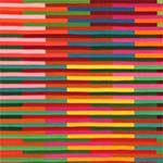
Working Blue

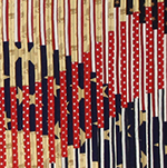
Not for the first time, I'm making a quilt consisting almost entirely of blue fabrics. There are some grays, some blacks, a beige, a white, but mostly blues -- as many as I could find in the relatively restricted world of commercial cottons. (And I wanted to use solids, so the world got even smaller.) Why blue? Because I'm going after a certain architectural texture -- glass facades reaching, like toadstools, for the sun -- and I wanted that flat, mirror-like effect of the reflected sky divided into thousands of discrete squares and rectangles.
"People like blue," says my artist friend Brian, who tends to shun it, as do I, for the most part. Except for blue chips, blue jeans and the aforementioned fabrics, you won't find very much of it in my house. It's just too popular, too omnipresent (sky and ocean), too beautifully banal. Apparently, a Cambridge psychologist did a study and found (God knows how) that even Rhesus monkeys prefer blue. Why? Perhaps it brings out the bubblegummy pink of their faces. That's one of the theories about Caucasians' fondness for blue -- that it goes well with our not-really-white skin. But with red hair, hazel eyes and what I like to think of as a peaches-and-cream complexion, I tend to move down the color wheel a bit, into green, which has always taken a back seat to blue. They don't call it a secondary color for nothing.
Overall, I like secondary colors more than primary colors, tertiary colors more than secondary colors, quarternary colors more than tertiary colors. And quinary colors? I'd marry them if I could. I'm kidding, of course. I often get asked what my favorite color is, even by art-world professionals, and the inquisitors always seem disappointed when I say I don't play favorites, as if they've been cheated out of some valuable insight into my artistic personality. I suspect there aren't many valuable insights into my artistic personality, but if there were, they probably wouldn't have much to do with color. For me, colors are tools, not talismans. What I'm looking for, when I choose a color, is the right tool for the job.
In that sense, blue is as good as any other color, maybe even a little better, given its associations. Blue is a happy color, an optimistic color -- "blue skies, smiling at me." Strangely, it's also a sad color -- "the blues," which should really be called "the grays," in my opinion. Blue is a calm color, a peaceful color, the color with which the United Nations attempts to unite nations. It is the color of wealth (blue bloods), the color of spirits (blue laws), the color of Democrats (blue states), the color of lewd and lascivious material, whether on stage on in films. You hadn't really seen Buddy Hackett, people used to say, unless you'd caught him "working blue" in Vegas.
At the opposite end of the spectrum is the Virgin Mary, who, from the Renaissance onwards, was almost synonymous with the color blue, so often did painters drape her in its magnificent folds. For hundreds of years before that, artists had avoided blue -- not for any reason in particular, it just didn't catch their fancy. But the extreme difficulty of procuring a decent blue -- lapis lazuli had to be hauled all the way from the mines of Afghanistan -- made it the perfect candidate for those rare and precious occasions when the Mother of Christ, through the wonders of pigment suspended in oil, made herself known to Jesus' followers.
That's a lot of baggage for one color to carry around, not that the other major colors don't have their own baggage. As a geometric abstractionist, I don't tend to think about a color's associations very much. But I've started moving toward more social content in my quilts, so this kind of thing must be kept in mind. Would I ever base an entire work on the various cultural meanings that attach themselves to colors? Oh, once in a blue moon, I suppose, keeping in mind that the next blue moon, which won't really be blue -- that's not why they call them that -- is only a little over two years away.
|
|
The Greenhouse Effect
You can always tell who the tourists are in New York City because we're craning our necks to take in the whole length of a building as it scrapes the sky. Natives seldom look up, seemingly oblivious to the fact that they inhabit a forest of redwoods. Or maybe they're willfully ignoring the towers of steel and glass that we now know are vulnerable to the very same gravitational pull they so beautifully defy. What used to seem like impregnable fortresses now seem like arrays of dominoes waiting for the next errant child to come along and tip over the first one.
After 9/11, we might have expected skyscrapers to hunker down, show some backbone, but that's not the way things have gone. Everywhere except Ground Zero, they continue to emerge from the earth, fern-like, their glossy fronds soaking up the available light. And they continue to be adorned in glass, that most fragile-seeming material, which has given our built environment its incredible lightness of being. A half-century into the Glass Age, we tend to forget what architecture critic Lewis Mumford once called "the window-pocked wall," with its slits and slots through which those inside peered outside. Today's skyscrapers are more like jewel boxes, capturing light, reflecting it, refracting it, shimmering during the day, glowing at night.
Amazing strides have been made with materials and processes so that today you can do just about anything you want with a building -- curve its walls in ways only a computer can understand, rhythmically rotate its floors, endow its facade with the ability to respond to the environment, shading itself from the sun, harvesting the wind. But as a designer I'm more drawn to the skyscrapers of the 1950s and 1960s, when the curtain wall, with its patchwork quilt of glass and metal, was giving the American cityscape an extreme makeover. By separating a building's facade from its skeletal frame, its skin from its bones, architects were suddenly presented with a blank canvas, and some of them made the most of it, creating masterpieces of shape and proportion, color and texture -- modern art en plein air.
I'm thinking of Lever House, the Seagram Building -- all those stele-like slabs that, rising from the ground, turned Manhattan into a cemetery for the Gods. There's a simplicity about these buildings, a tooled precision, that makes them as impressive, in their own way, as a Gothic cathedral. "God lies in the details," Mies van der Rohe famously quipped, and it was a fastidious attention to detail that put this style -- dubbed the International Style -- over the top. From now on, buildings would be machines for living -- rational, abstract spaces freely adaptable to any of life's activities. And the curtain wall, with its orderly arrangement of mullions and spandrels, squares and rectangles, represented that rationality, that abstraction.
The International Style, as we all know, was a victim of its own success. Corporations embraced it for its aura of stripped-down, business-class efficiency, not to mention its relatively low price tag. But not all architects had Mies' eye for detail -- in fact, no other architect had Mies' eye for detail -- and a lot of boring buildings shot up, all vaguely the same and just plain vague. Suddenly, there was glass everywhere, but its limitations as a building material were starting to show. "The modern architect has tended to equate the degree of his modernity with the number of square feet of glass he provides," Mumford wrote at the time, "and he has thus created some of the most intolerable hothouses and cold frames that have ever been offered as permanent homes for human beings."
Today, this greenhouse effect has been largely ameliorated with advances in glass manufacturing. Consequently, there's more glass than ever, skyscrapers reflecting the reflections of other skyscraper reflections in an infinite mirror of dematerialization. If the high-rise office buildings of the mid-20th century suggested transparency and openness, the buck stopping here, for all to see, today's skyscrapers pass the buck from one shiny surface to another in the architectural equivalent of three-card monte. Then again, isn't that how the world works now, the wealth of nations reduced to phosphorescent blips bouncing from one computer screen to another?
Do we not, finally, get the buildings we deserve? Gothic cathedrals reached toward Heaven, humbling the worshippers, who raised their heads upward, awaiting the call to God's kingdom. Today, we're still craning our necks, but instead of the Almighty, we worship the Almighty Dollar, the existence of which we must increasingly take on faith.
|
|
A Star Is Born
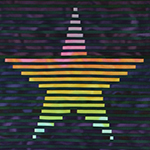
Call me Betsy Ross, but I just finished making a new American flag. Mine is the prescribed size and shape, the correct proportions, and it has the requisite 13 stripes, although I let loose with a veritable rainbow coalition of overlapping colors instead of limiting myself to red and white. And the canton, which has traditionally contained "a new constellation" of stars, one for each state of the union, now has a single star, my aesthetic nod to E Pluribus Unum.
I didn't set out to make a new American flag, although, should Congress decide to rethink Old Glory, my position is, "If called, I will serve." No, I just set out to create a flag of any kind--an emblem, a symbol, a sign. Like Jasper Johns, who's been hanging American flags in galleries and museums for over half a century, carving out a new niche for art in the process, I was interested in flags as abstractions--deceptively simple graphic forms, the various meanings of which flap in the breeze, this way and that. Also like Johns, I was interested in a flag's lack of meaning, the way its utter familiarity can drain it of content. My goal, forged in the smithy of my modernist soul, was to create a new flag, a pure flag, a flag without a country--an unfamiliar flag drained of all content except flagginess.
It didn't work out that way. It seldom does. As I tried to launch my flag into orbit and perhaps plant it on the moon, the American flag started exerting an irresistible gravitational pull. And no wonder: Except for the Christian cross, it may be the most potent symbol in the history of Western civilization. We Americans can get very worked up over our flag. "No other nation treats its flag the way Americans do theirs," Robert Hughes wrote in American Visions by way of introducing Johns' poker-faced devotion to stars and stripes, if not the Stars and Stripes. "It is a peculiarly sacred object. You must handle it with care, fold it in a ritually specified way, salute it, and never allow it to touch the ground."
I not only allowed mine to touch the ground, I walked on it--one of the many hazards of working on the floor. Luckily, mine is not a true American flag (not yet, anyway). The Daughters of the American Revolution won't come storming through my studio on their way to a constitutional amendment laying out what we must and mustn't do with our flags. But I didn't miss by much. As I said, my flag has the requisite 13 stripes, the prescribed size and shape, the correct proportions. Only the colors are off, that and the number of stars--oh, and a few other things. But if you ask me, it could pass for one of those colonial-era flags that always give you this weird road-not-taken sense of where American history might have gone.
For whatever reasons, we've always been a little vague about what the flag should look like. The original flag resolution, which appeared in the Journal of the Continental Congress on June 14, 1777--Flag Day, as it would come to be known--kept it short and sweet: "Resolved, that the flag of the United States be thirteen stripes, alternate red and white; that the Union be thirteen stars, white in a blue field, representing a new Constellation." A conceptual artist could have a field day with that description, sending stripes of various widths and lengths fanning out in any number of directions. (How many ways can you arrange 13 stars?)
The Flag Law of 1795 specified that a stripe as well as a star be added for each new state admitted to the union, but that didn't last long. In 1818, Congress passed the Flag Act, which held the number of stripes at 13, one for each original colony, while letting the stars proliferate like sparks off the Big Bang. A few months later, President Monroe added a codicil that spelled out how to arrange what were now 20 stars. But it wasn't until 1912, through an executive order by President Taft, that the relative proportions of the flag (and the arrangement of its now 48 stars) got officially prescribed.
Throw in Alaska and Hawaii, forget about Puerto Rico ever becoming a state, and the flag is starting to look a little set in its ways. It hasn't changed during most of our lifetimes, and that's part of why I was drawn to it: Icons are for tweaking. Another reason I was drawn to it is that I was born on Flag Day--not quite as ripe a symbol as George M. Cohan having been born on the Fourth of July, but I still believed that everybody hung their flags on their front porches to celebrate my birthday long after I'd given up on Santa Claus.
What can I say, I'm a Yankee Doodle Dandy, a Yankee Doodle, do or die. And it's a grand old flag I've made, a high-flying flag, forever in peace may it wave, the emblem of the land I love and of anything else it winds up standing for. Like the country it represents, the American flag contains multitudes, unfurling its myriad meanings from July 4th to Labor Day to Veterans Day to Presidents Day to Memorial Day, all the way back around to July 3rd, which, truth be told, is the day George M. Cohan was born.
|
|
What Makes A Legend Most
I've been thinking about Betsy Ross lately. Here's a woman who managed to insinuate herself into the history books through the sheer act of sewing, so attention must be paid. No one knows for sure whether or not Ross, a Philadelphia upholsterer, made the first American flag. Legend has it that she was hired by a special committee of the Continental Congress that included General Washington himself, who dropped by Ross's shop on Arch Street one day, unannounced, and presented her with a rough sketch of what he was looking for. Ross, who by all accounts was an excellent seamstress, took a look at the sketch and did what seamstresses have been doing since the invention of needle and thread: She recommended changes.
Washington had drawn a square; Ross suggested a rectangle. Washington had gone with six-point stars; Ross, grabbing a piece of paper, showed how you can achieve a five-pointed star with some clever folding and a single snip of your scissors. Washington had flung his own stars, one for each colony, across the flag's union; Ross arranged hers in a circle, so that no colony would have pride of place over any other.
It must have been a humbling experience for the expectant father of our country to heed Ross's advice, but heed it he did. Or so we've been told by Ross's descendants, who sprang the story on an unwary public in 1870, nearly a century after it supposedly occurred. Why you would sit on that kind of news for so long is a question only the descendants themselves could answer, but many of them signed notarized affidavits attesting to the number of times Ross had told them the story. And that was enough, as America's centennial celebrations approached, to turn family history into national myth. We now had a mother of our country to go along with the father of our country, their newborn child swaddled in a broad-striped, star-spangled banner.
Strangely, Washington, an inveterate letter-writer and diary-keeper, never mentioned having signed off on Ross's design. Nor did the Continental Congress mark the occasion, through word or deed. The only real proof we have that Ross made the first flag, in fact, are those sworn affidavits, which is enough for most patriots but not enough for most historians. What must the historians think, then? That Ross's family tried to pull a fast one on the American people? That Ross tried to pull a fast one on her family? We've all stretched the truth before, secure in the knowledge that our little white lie wasn't going to land us among the Founding Fathers. Did Ross, as she got older, create her story out of whole cloth?
Possibly, but she needn't have. She'd already led an exemplary life, one that was infused with the Spirit of '76. She'd lost two husbands to the Revolutionary War, and she'd married the first one in defiance of her Quaker brethren, who disowned her. She'd kept her business afloat when Philadelphia was awash in British soldiers. And over the course of her long career, she'd sewn dozens, if not hundreds, of American flags--just not the first one, perhaps.
Throughout recorded history, women have been swept to the margins of the page for engaging in the needle arts instead of the art of warfare. How ironic, then, that Ross, who had fire in her belly as a young woman, was posthumously added to the American mythos for sitting by the hearth and sewing pieces of fabric together. Today, a woman with Ross's spunk is more likely to be found cleaning a rifle in Kabul than threading a needle in Philadelphia. Well trained, well equipped and drawing on 200 years of American history, G. I. Jane is fully prepared to defend her country. Just don't ask her to sew a buttonhole.
|
|
|
|